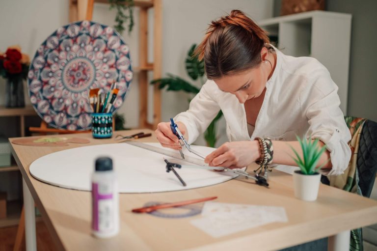
When people begin learning calligraphy, the first thing they learn is how to write the letters themselves, how to properly hold the pen and form shapes. But the thing that separates professionals from beginners is usually that they understand the importance of the spacing.
Spacing allows a composition to breathe, balance, and feel rhythmic. Even beautiful lettering can fall flat if the spacing is off.
Calligraphy is about the space between letters too
A lot of people don’t really understand that the spacing around a piece of lettering is almost as important as the lettering itself.
Pros are very careful to leave the space they think is necessary between letters, words, and lines. Good spacing will help the composition flow, as well as giving the composition a sense of calm.
Great measurements may not work every time
A big part about spacing in calligraphy is that it doesn’t always relate to great measurements. It doesn’t mean that the lettering will be wrong even if every piece of spacing is exactly the same size because there is so much to do with the way the letters are formed that the gaps need to look right visually instead of just being accurate measurements.
The lettering should always look correct visually; curved letters take up different space than straight letters, for example. Because of this, a lot of spacing has to be done by eye instead of by measurements.
It adds a natural rhythm to the writing
A good sense of spacing will create a sense of rhythm that runs through your composition. Rhythm is something that makes the lettering look fluid and natural as opposed to being random or mechanical.
As soon as you see a composition that has no spacing between letters, or a rhythm that doesn’t feel quite right, it’s going to stand out to you even if you can’t quite explain what feels off. This type of observation and understanding of the flow of the composition is something that comes over time with professional lettering practice.
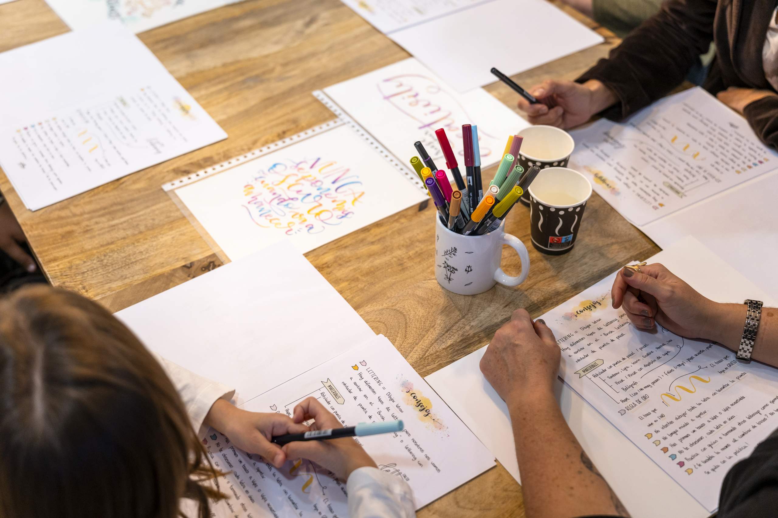
Beginners focus a little too much on the lettering and not enough on the spacing
One of the things that a lot of beginners do is focus too much on one letter at a time and not enough on the composition of how these letters are placed within the piece.
Pros always take a step back to look at their composition to make sure it all works together and aren’t focused only on the details.
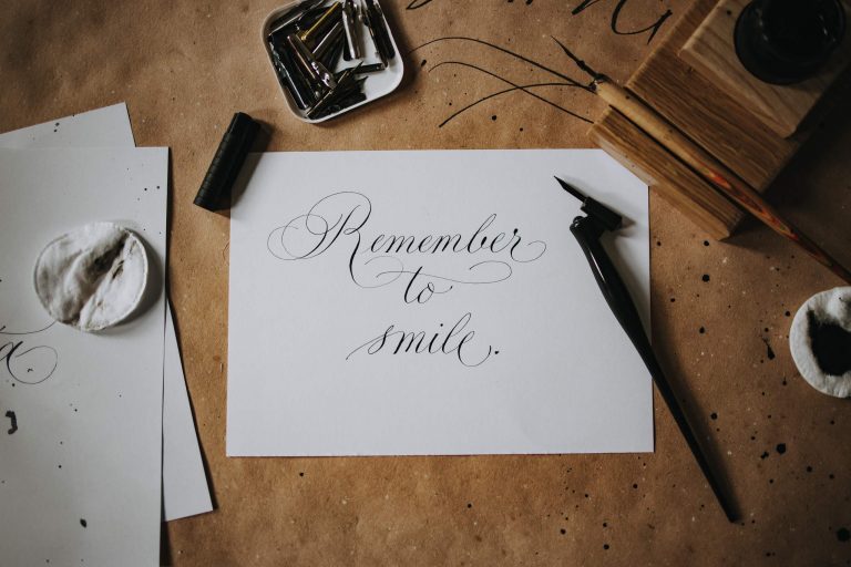
The spacing makes the piece elegant more than the details
Beginners tend to focus on trying to figure out ways that they can add detail to their lettering that will make them look better and more elegant.
Often, clean and simple letters are more impressive and professional to look at when there are balanced measurements between them than complicated, overdecorated lettering.
In conclusion
The spacing in your lettering is part of the design and it’s not just a negative space between the letters.
Once you start paying attention to the visual flow that spacing brings to the piece of lettering, it starts to look a lot cleaner, calmer, and more elegant.